Crip The Resistance: Thoughts and Resources for Accessible Protests

Crip The Resistance: Thoughts and Resources on Accessible Protest, black background and white text

What does protest mean for disabled people, and how can we contribute through our lived experience or active engagement? I can’t access in-person marches or similar events, and sometimes I must completely disconnect from current events to stay healthy. It’s hard to find solace when our rights and safety are threatened, so I write when things become too much. That’s how I channel my anxious energy, and it works for me.

There is no right way to protest – one method does not count more than another. Protest is about building each other up in resistance to crisis. It’s about those with privilege filling the gaps while amplifying marginalized voices. “You’re not doing enough” shames those who may be struggling to get through another day, or who don’t have the means to contribute more of their time or energy. We don’t all have to show up and hold signs and tweet to be in a political movement. For those who bear the weight of oppression, our lives and bodies are inherently political, and surviving is a form of protest. Surviving can be enough.

Read moreCrip The Resistance: Thoughts and Resources for Accessible Protests

Comic Review #1 – The Killing Joke

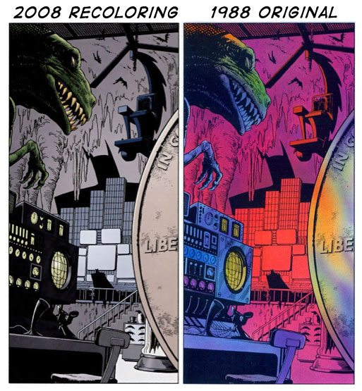
It’s been a while since I’ve read a Batman comic, and I’ve surprisingly never read The Killing Joke. This graphic novel is considered a classic, written by Alan Moore of Watchmen and V for Vendetta fame, and hauntingly illustrated by Brian Bolland. I purchased the 2008 deluxe edition, which was recolored by Bolland; he uses a cooler palette than the original color artist, and makes the flashback scenes into black and white, with small touches of color to add emphasis on certain objects. I’ve seen the original 1988 comic (thanks, internet!), and I definitely think the new coloring transforms the comic into the darker, weightier story it was meant to be. You can see the difference here:

kj_comparison

The original looks psychedelic, which isn’t necessarily bad, but it doesn’t fit the dark theatrical nature of some of the scenes. The recoloring and illustrations are the best things about this comic. That isn’t to say that I didn’t think the story was well executed, but the art is so great here that it overshadows the other elements. I particularly liked the way the Joker was drawn – he looked sadistic and frightening, but you could still see the human behind it. The carnival scenes are effectively chaotic, highlighting the perverseness of the Joker’s thought process and actions.

Despite my praise for the artwork and plot execution, there are some very problematic things about this novel – namely the treatment of Barbara Gordon. So let’s just get right down to it so you can see what I mean.

Read moreComic Review #1 – The Killing Joke