“Wait, what? That’s bullshit! I won!” I yell as I imagine myself flipping the table (as I can’t actually flip it, and I wouldn’t do that anyway).
And so ends our third round of Charterstone, the latest tabletop adventure by designer Jamey Stegmaier. I don’t think I’ve ever seen my boyfriend so enthused by a board game, and I don’t think he’s ever seen me so angry about losing. At its core, Charterstone is a worker-placement game that feels similar to Stegmaier’s popular Viticulture. You start with two worker tokens to place on various buildings on the board, and those buildings give you resources, and those resources let you earn victory points. But what sets Charterstone apart from similar titles is that it’s a legacy-style game. That means, every time you play, you alter the game; this includes opening new mechanics, advancing the story, using special components, and more. It’s like unfolding a present after every game – and that surprise is addicting.
Or, as evidenced by my quote above, the discoveries can be infuriating. Without giving too much away, let’s say that an end-game card drastically changed the score in a way that was out of my control. My boyfriend Michael gloated, marking a victory on his score tracker, while I jokingly stated that the game was cheating. I thought I was going to be undefeated, having won the two previous rounds. But in my mind, I’m still a champ – or, if you listen to Michael, a sore loser.
So, what’s it about?

In Charterstone, you and up to five other friends play as citizens of the Kingdom of Greengully, ruled by the Forever King. He asks you to explore and expand the Kingdom, using your unique skills to uncover resources like coal and pumpkins. The story here is thin, leaving you lots of room to roleplay. As you progress through the game, you’ll uncover more of the story; but the focus is on players using their creativity to build their world. And I adore that.
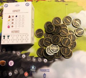
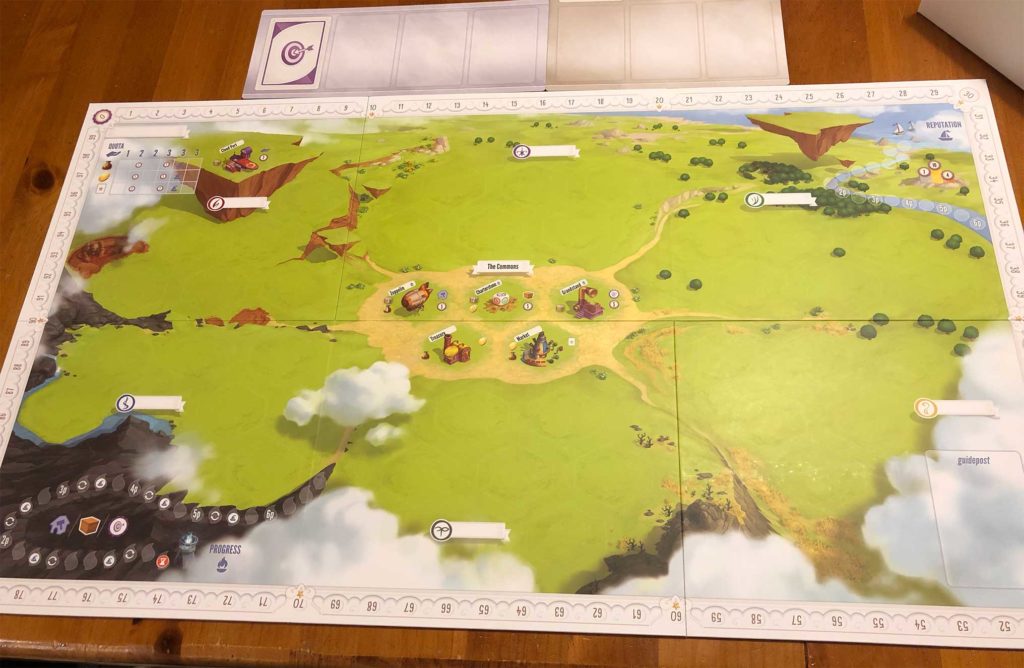
Players can choose a unique character to inhabit – complete with your own Charter Chest to store items and keep track of victories. We love this concept, as it adds to the theme and helps you feel connected to your character throughout the campaign. The artwork is reminiscent of Pixar’s Up, and the board itself is vibrant and inviting. Colorful resource tokens and fancy metal coins add to the charm. The main cards are all in a large box with a magnetic snap closure. It’s no surprise that the game is beautiful, as Stegmaier’s attention to detail is renowned.
Accessibility and Creative Solutions
There were some accessibility issues we encountered, and we had to come up with hacks to fix them. For one, the board is fairly large, making it difficult for me to see all the buildings and their cost/resource bonuses from my sitting position. Since this is a worker-placement game, knowing this information is vital – I have to know where to place my workers to get the most points. At the start of the game, there are only a few buildings, which isn’t hard to work with, but as the campaign went on, we added more buildings to the board, making it near impossible to mentally keep track of all the options.
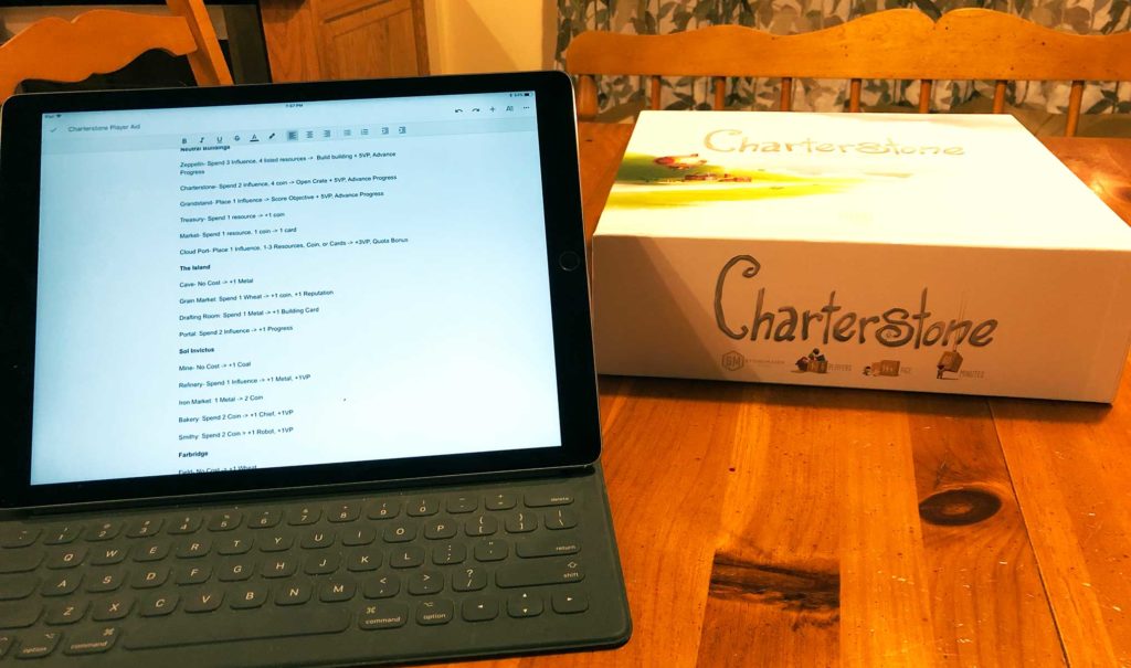
Michael and I solve this issue using Google Docs. Since the board changes every time you play, standard player aids won’t work. With Google, though, Michael types up the available buildings and various options on the board. Since Docs have live, shareable editing, the changes he makes on his iPad instantly appear on the document on my phone. This way, I can just look at my phone when deciding where to place my workers. This setup took some time, but after the initial prep, it became part of the game seamlessly. However, I wish there was a document already made up and available on Stonemaier Games’ website, making the setup of this system easier.
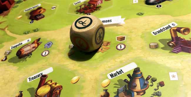
Michael is color blind, and there is only one issue for him now (three rounds in): the clay and wood resource cubes are identical color-wise and are too similar shape-wise to make it easy to tell them apart at a glance. But beyond that, every item and icon in the game has both a color and a symbol or shape; there’s no need to rely on color alone to convey important information. The iconography in the game overall is easy to understand and remember, though some of the text on the cards can be small.

A huge part of the game centers on the card box and placing stickers found on those cards onto the game board or in the rule book. Repeatedly looking through the card box could be a challenge for anyone who has a dexterity-related disability. You also have to be fairly precise when placing the stickers, so if your hands shake, you might require assistance. Minor spoiler – some objective cards have a scratch-off element, too, which is another task that may prove difficult. I do think, while some of these features are cool and add novelty to the game, some of the stickers could be eliminated. For example, instead of using stickers as rules, have the rules already in the book and warn players not to read ahead.
One great thing about this game, accessibility-wise, is the lack of hidden information. I touched on this in a previous post, but hidden information means I can’t put my cards down or view my resources the way that works best for me. When players don’t have hidden information, like in Charterstone, I can arrange my items where I can see them; I don’t have to shuffle through cards one by one or hide my coins in a spot where I can’t reach them easily.
Ultimately, Charterstone is worth playing, even if you must spend the time to make it accessible, as we did. You’ll get at least 12 hours of gameplay, since the campaign lasts 12 rounds, and each round can last an hour or more. And when you complete the campaign, you’re left with a game created by the decisions you made while playing.
Have you played Charterstone? What was your gaming experience? Let me know in the comments! If you’re interested in purchasing this game, you can find it on Amazon!


Thanks for the review and insights. It will help me choose, or adjust, games for my gaming group and students with accessibility in mind. Our gaming group hasn’t started Charterstone yet, but it is in the queue.
Thank you, I’m glad my review was helpful!
Trying to avoid spoilers. There will be a place where color blindness can be an issue. You probably already know of some workarounds, but I would suggest not being afraid to write on game pieces. Numbers or pips or something. My wife suggests swapping them out for runts, although they only have 5 where you need 6.
Good to know, thanks!